Pull the network cable between a PLC and its logger for two minutes, plug it back in, and look at the trend. On a surprising number of systems you will see nothing unusual: a smooth line from the last value before the outage to the first value after it. The chart looks complete. Two minutes of data are missing, and nothing on the screen says so.
On most plants that is an annoyance. On an energy site, where the record is used as evidence, it can be expensive.
How the line gets there
A trend is drawn by joining stored points. If nothing is stored during the outage, the drawing tool simply joins the point before the gap to the point after it. Whether that happens depends on three things.
What was stored. Many collectors write nothing at all when a source stops answering. There is no record that anything went wrong, only an absence of rows, and an absence is easy to miss.
How values are compressed. A deadband or exception-based store deliberately writes nothing while a value holds steady. To the reader, "nothing stored because nothing changed" and "nothing stored because the PLC was unreachable" look identical unless the historian records the difference.
How the chart draws. Dashboards often have a setting for this. In Grafana it is the "connect null values" option, and SQL-backed trends usually interpolate between whatever rows they find. Linear interpolation across a gap draws a straight ramp; step interpolation holds the last value flat until the next one, which looks even more convincing.
None of these is a bug in isolation. Together they produce a trend that is wrong in the most dangerous way: plausibly.
Why it matters on battery and generation sites
The data from an energy site is used to answer commercial and technical questions after the fact.
- Service delivery. Frequency response and reserve services are judged against measured power at one-second resolution or faster. A smoothed line across two minutes can show a response that was never measured, or hide one that was.
- Trips and investigations. When a rack trips or a breaker opens, the order of events across PCS, BMS and switchgear matters. A gap drawn as continuity puts events in the wrong order.
- Warranty. Battery warranties often depend on temperatures, cycle counts and state of charge over years. If missing periods are filled in, the record cannot be relied on in a disagreement with a supplier.
- Compliance tests. Grid-code tests produce data that the network operator reviews. An undeclared gap is the kind of thing that turns a pass into a re-test.
What an honest record looks like
The fix is not complicated, but it has to be designed in.
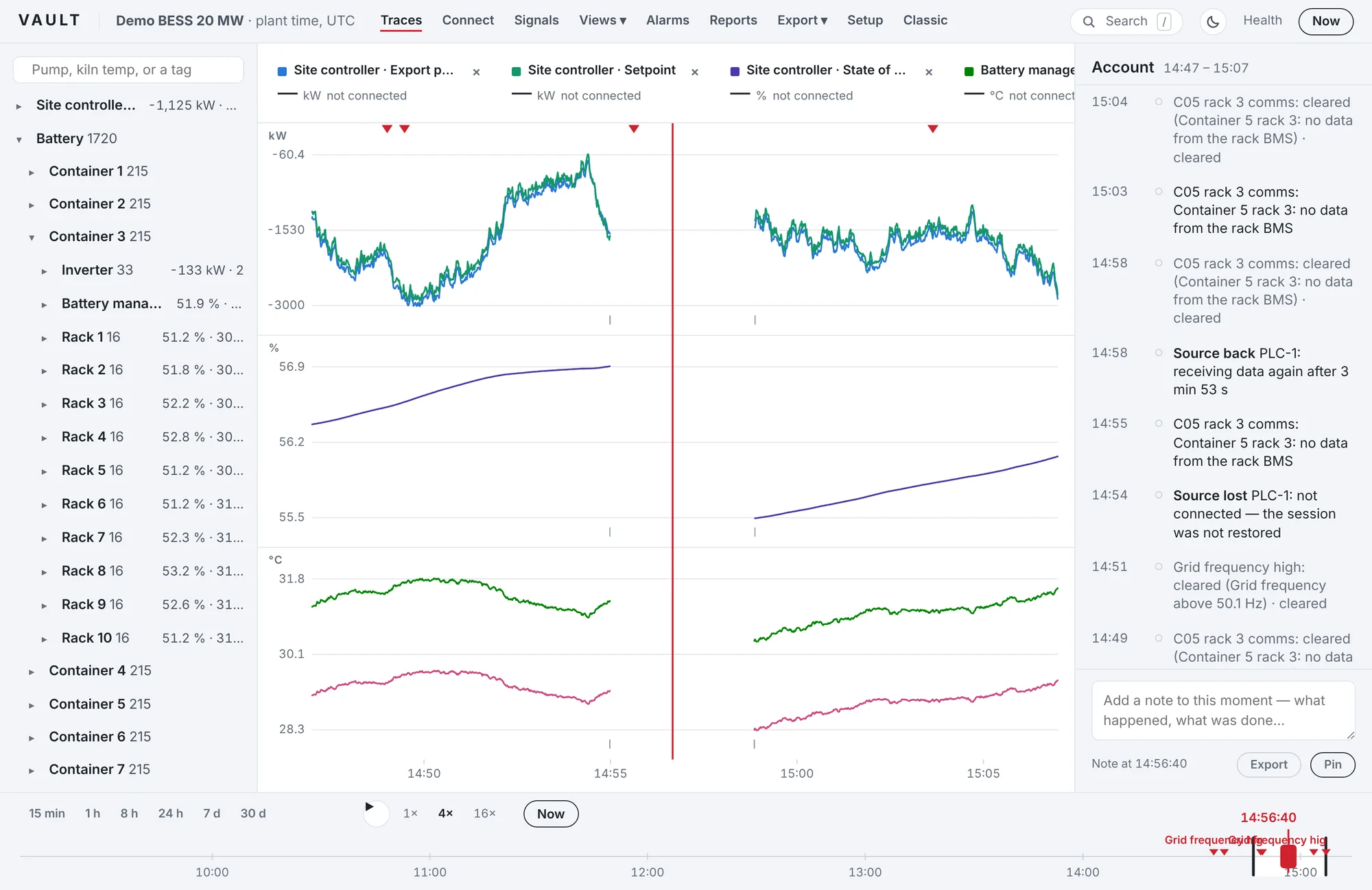
- Store the gap. When a source stops answering, write a gap marker at the moment the data stopped, with its cause: not connected, restarted, disk full.
- Store quality with every value. A value the server reported as bad is a gap, not a number. A value that is uncertain should look different.
- Never draw across a gap. The trend breaks, with a mark at each edge, and the readout shows a dash instead of the last good value.
- Declare compression. Every export states which values were deadbanded or compressed, so a reader can tell "unchanged" from "unknown".
- Recover what can be recovered. OPC UA servers keep recent notifications. After a short drop, a client can ask for them again with Republish and fill the hole with real data. Only what cannot be recovered should be marked as missing.
A ten-minute test for your own system
You can find out what your historian or dashboard does without reading any documentation. Do this on a test bench or a non-critical signal, never on a live control path.
- Pick a signal that changes every second, such as frequency or active power.
- Note the time, then disconnect the source from the logger for two minutes: pull the cable, block the port, or stop the server.
- Reconnect it and wait five minutes.
- Look at the trend over a window that includes the outage. Does the line break, or does it ramp or hold flat across?
- Export the same window to CSV. Are the missing two minutes visible as missing rows, flagged rows or an explicit marker? Or are they filled?
- Look at the system's event list. Does it record when the source was lost and when it came back?
If the answers are "it ramps across", "the rows are filled" and "there is no event", you know what your records look like after every network blip on site. That is worth knowing before someone asks you to explain a chart.
How Vault handles it
Vault was designed around this problem. It writes the gap marker the moment a source is lost, stores quality with every value, never draws across a gap, recovers what an OPC UA server can resend, and declares compression on every export. You can see it on the product tour and read how it is tested on how Vault is tested.